Skip to content

Authentic Ocean Data

Authentic Ocean Data

Integrating authentic data into learning environments provides unique opportunities for active learning and problem solving using real world applications. There are several challenges, however, in integrating these data into learning environments, particularly information learning environments where the background knowledge of you audience can vary widely. First, the inherent size and complexity of many authentic datasets as well as the limited quality control and processing conducted on near-real time streaming data can make them unwieldy for educators to work with. Second, in the instances when these authentic datasets are curated for an educational setting, they rely entirely on visual displaces, making them inaccessible to anyone with a visual impairment, other print-related disability, or innumeracy. By scaffolding authentic data to support sensemaking in learners from a wide range of backgrounds and abilities, we aim to broaden participation in STEM and showcase to all audiences sonification as a way to perceive scientific information.

The Accessible Oceans project uses authentic data from the National Science Foundation-funded Ocean Observatories Initiative (OCE-1743430) that was quality controlled during the OOI 1.0 Data Review and processed into Data Nuggets during the OOI Synthesis & Education project (NSF OCE-1841799). For more information and perspectives on integrating OOI data sets into the classroom, check out Greengrove, et al., 2020. "Using Authentic Data from NSF's ocean Observatories Initiative in Undergraduate Teaching: An Invitiation." https://doi.org/10.5670/oceanog.2020.103.

Click on the links below to learn more about each of the curated datasets used in the Accessible Oceans Project.

OOI Data Nuggets
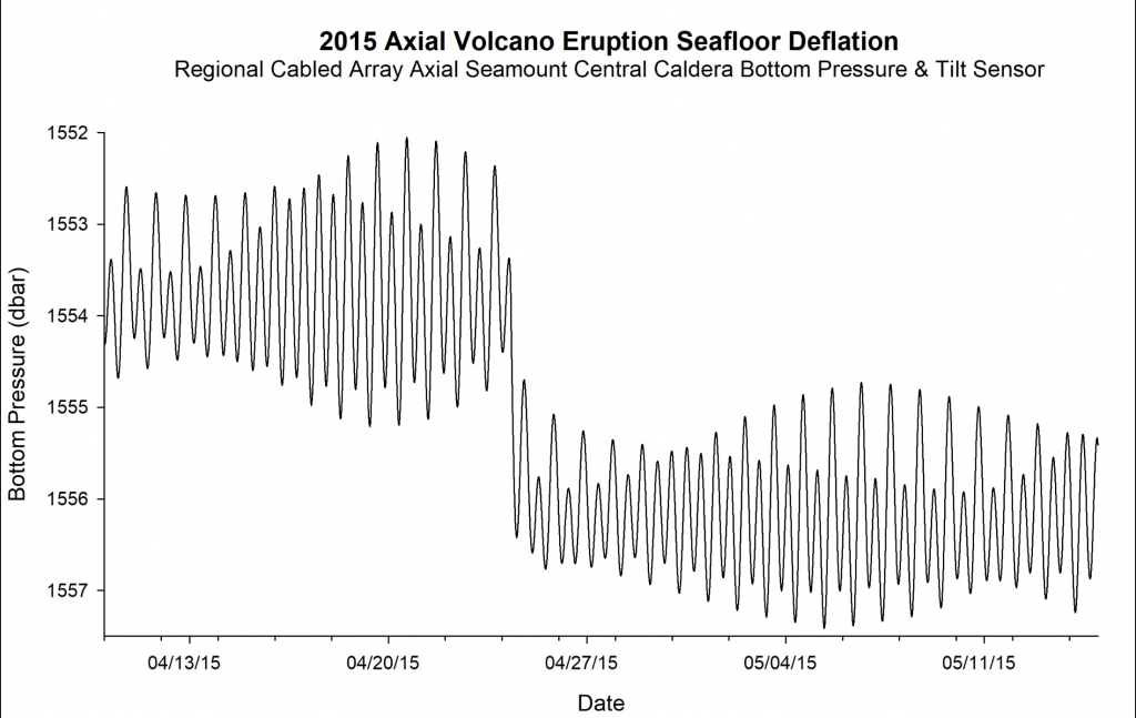
graph that depicts changes in the bottom pressure of the ocean over one month. The data was taken from sensors on the Juan de Fuca plate in the NE Pacific Ocean. The changes in bottom pressure in the graph depict daily fluctuations of the tidal cycle across the entire graph, but is marked by a large shift in bottom pressure in the middle of the data on April 24, 2015. The bottom pressure shifted as a result of the volcanic eruption — an indication that the seafloor dropped.2015 Axial Seamount Eruption

Explore seafloor deflation on the Axial Seamount during the 2015 eruption with data from the OOI Regional Cabled Array.

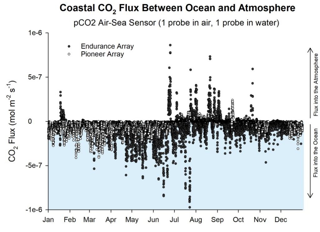
Graphic that contains two data sets of Coastal carbon dioxide flux between ocean and atmosphere. These data sets show the seasonal cycles of CO2 air-sea gas exchange during 2017 at two coastal locations – the Endurance Array in the NE Pacific (shown as black dots), and the Pioneer Array in the NW Atlantic (shown as white dots). Most of the outgassing — or CO2 release from the ocean into the atmosphere, occur during the summer months. CO2 absorption — a net flux of CO2 from the atmosphere into the ocean occurs throughout the year.FLUX OF CO2 BETWEEN
OCEAN AND ATMOSPHERE

Explore air-sea exchange of CO2 in two different ocean regions – coastal upwelling in the NE Pacific (OOI Endurance Array) and the cold, high latitude Argentine Basin (OOI Global Array).
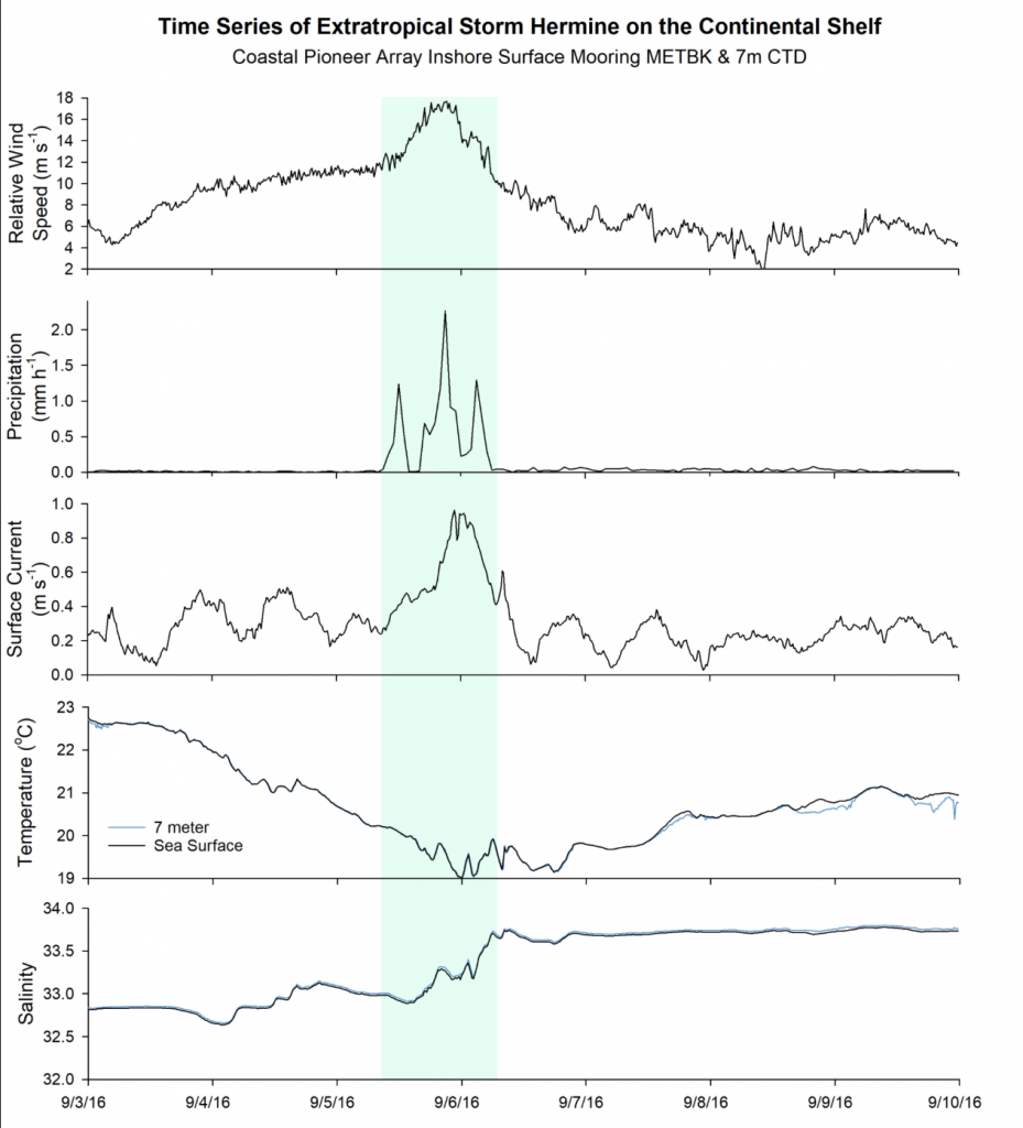
A time-series plot of five meteorological measurements — relative wind speed, precipitation, surface current, temperature, and salinity — are shown as individual panels stacked vertically. The five time-series plots show the response to the storm passage of Extratropical Storm Hermine over the Pioneer mooring array off the coast of New England during the first week of September 2016. A green band over the data during Sept 5th and 6th highlights how the mooring documented an increase in wind speed, an increase in precipitation, an increase in surface current speed, a decrease in sea surface temperature, and an increase in sea surface salinity.Turbulent Mixing from Extratropical Storm Hermine

Explore what happens to coastal New England waters as an extratropical storm passes over the OOI Pioneer Array.
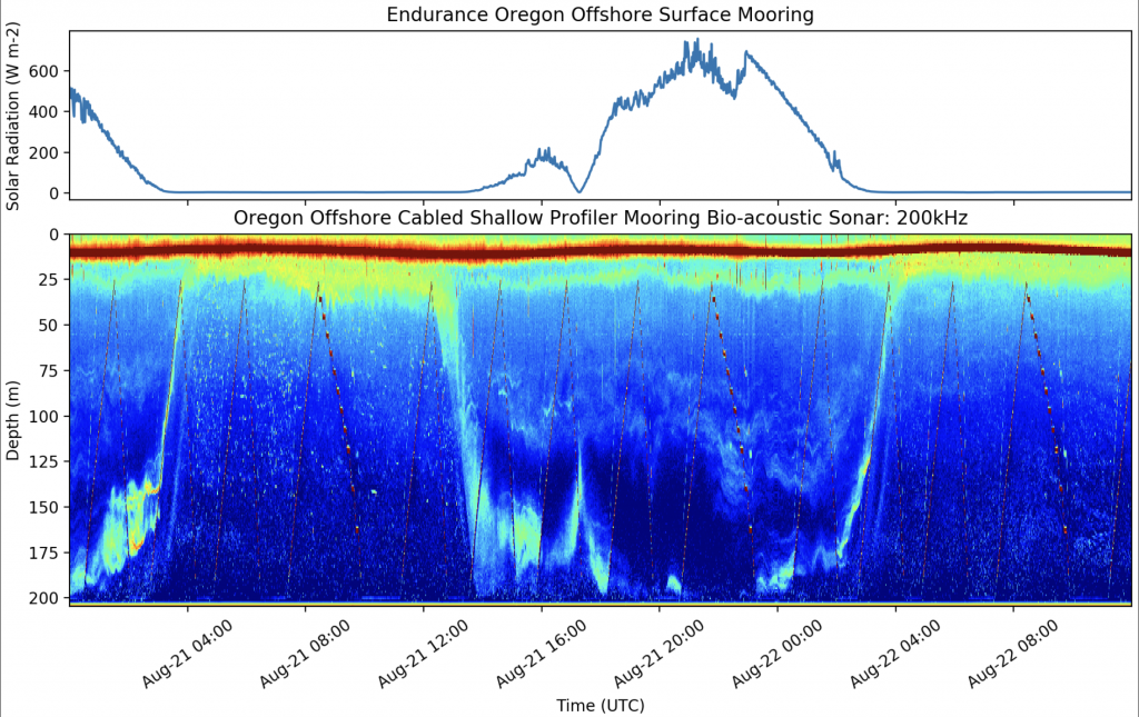
The graphic contains two sets of data as two vertical panels aligned to show the same 36 hour period across the 2017 Total Solar Eclipse. The top panel graph contains a single line that depicts the daily solar radiation cycle. The bottom panel is a color image of water depth and shows zooplankton daily vertical migration movement from Bio-acoustic Sonar data.Daily Vertical Migration Gets Eclipsed!

Explore what happens to zooplankton during a total solar eclipse using Bio-acoustic Sonar data from the Endurance Array Oregon Offshore Shallow Profiler Mooring.
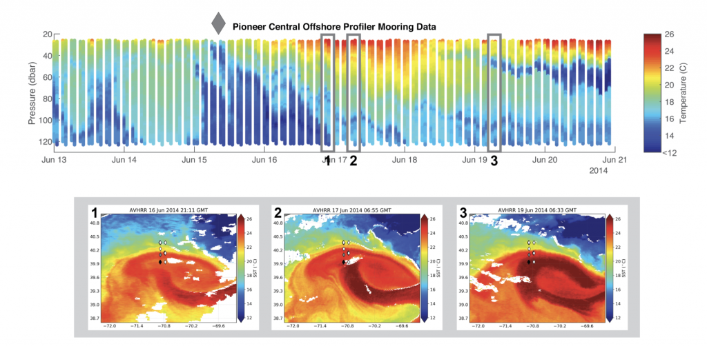
The graph depicts the profiler mooring temperature data across its water column over one week in June 2014. Each day contains eight colored bands representing water temperature across various depths and range from 12 to 26 degrees Celsius. The data over the week documents a warm core ring that contain warm Sargasso Sea water that travelled north into the cooler North Atlantic waters. Three slices of profiler mooring data are numbered 1, 2, and 3. Each number on the profiler mooring corresponds to a separate panel with three 2D images depicting sea surface temperatures on the ocean and match the time of the mooring data. The NetCDF 2D images show the formation of the warm core ring on the surface of the ocean.Warm-Core Ring Driven Shelf/Slope Exchange

Explore changes in the local environment around two OOI Pioneer Array Moorings as a warm-core ring passes by.

For more information on Data Nuggets, check out the Ocean Data Labs website.
Follow

Follow this blog

Get every new post delivered right to your inbox.

Email address