Audio Description Prototypes for Data Nuggets graphics
I’ve been a fan of Audio Descriptions (AD) in film and TV for awhile now. Most Netflix original content includes audio descriptions and I used to listen to more shows than I watch. I never have seen Daredevil, but I listened to every minute of it. And Stranger Things never sounded so good — and I still don’t know what the monster looks like. For those that want to listen and learn about the technology, there’s a good podcast on audio descriptions. Host Dallas Taylor describes how audio descriptions “could be for the masses,” and I agree. Audio descriptions are not simply for the blind and visually impaired. Just look at how podcasts have become a regular part of our media diet. Why not listen to our data visualizations and graphs too?
While audio descriptions are not sonifications, I wanted to explore the idea of creating audio descriptions as a baseline for sounding a graph when sonification isn't possible. I’m not a trained audio describer, so I may have conflated the “say what you see” rule with some science behind the graph a few times. As a document of the process, I created a script for all audio descriptions, recorded all audio descriptions in my home studio with a Sennheiser MKH-416 microphone, and edited and mixed the audio inside Logic Pro X with a little bit of EQ, compression, and de-essing (FabFilter Pro-Q3; Pro-C2; Pro-DS; and a bx_console SSL 9000J channel strip).
Below includes graphs from all five Data Nuggets our team has selected as part of the NSF AISL pilot. I’ve included only the graphics of data we are using for our sonification work. I copied most if not all of the audio description scripts as the alt-text for the graph images. I placed the matching audio description as .mp3 files next to each graph.
2015 Axial Seamount Eruption
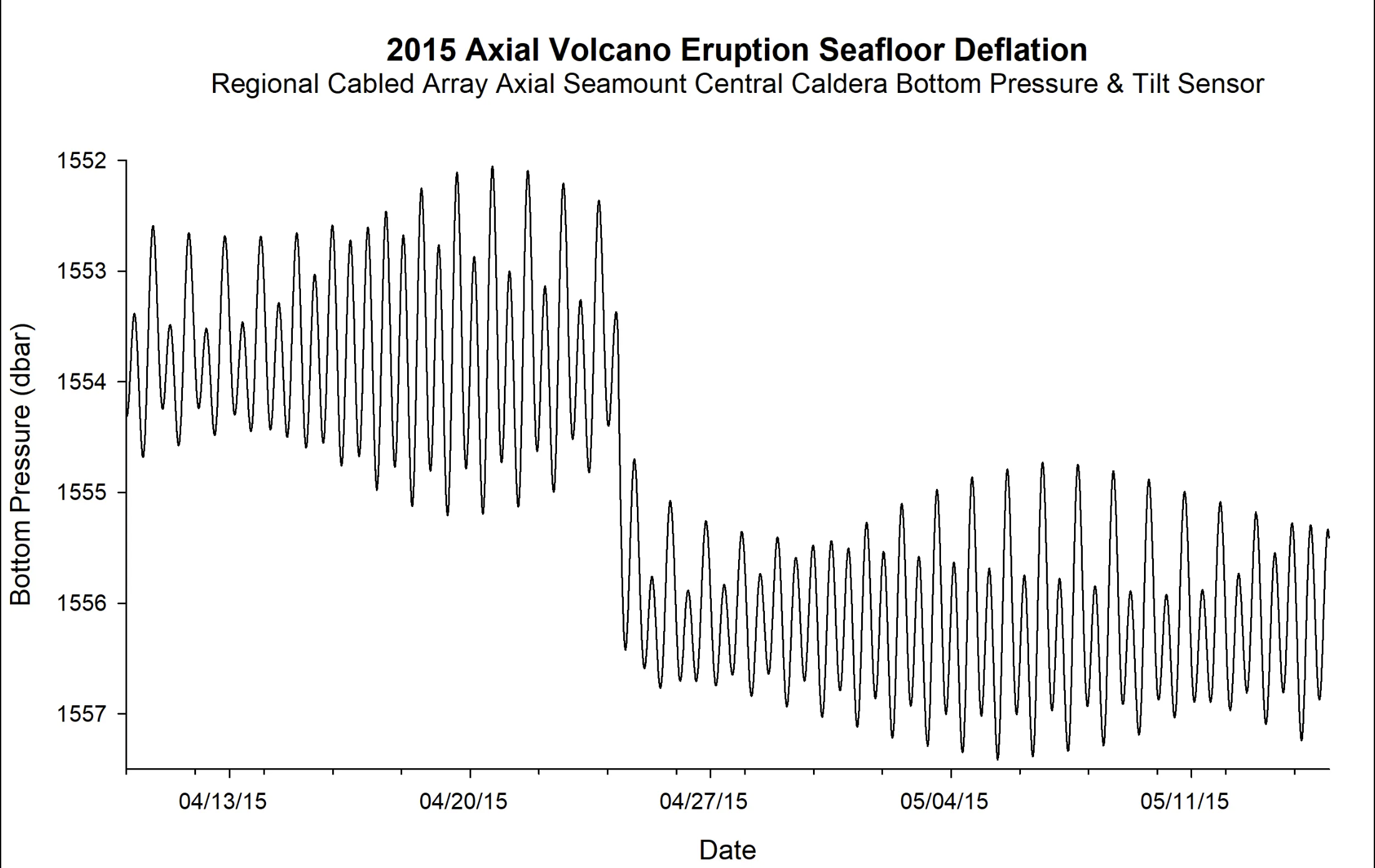
Audio Description for the 2015 Axial Volcano Eruption Seafloor Deflation graph.
2015 Axial Seamount Eruption
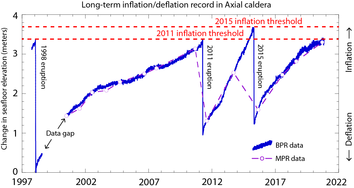
Audio Description for the long-term seafloor inflation and deflation in the Axial caldera graph.
Daily Vertical Migration Gets Eclipsed!
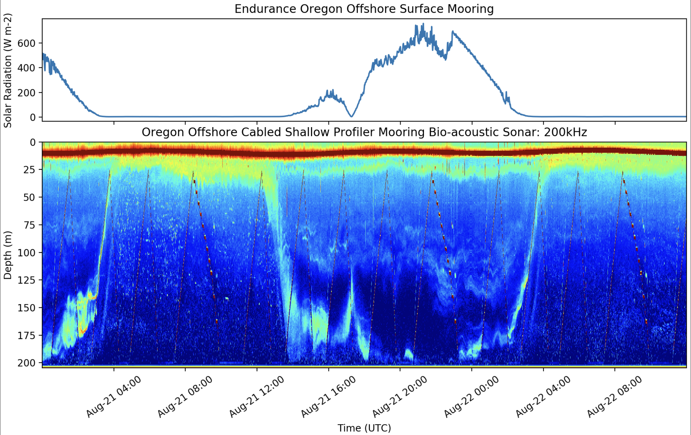
Audio Description for the solar radiation and bio-acoustic sonar graphs during the 2017 Total Solar Eclipse.
Flux of CO2 Between Ocean and Atmosphere
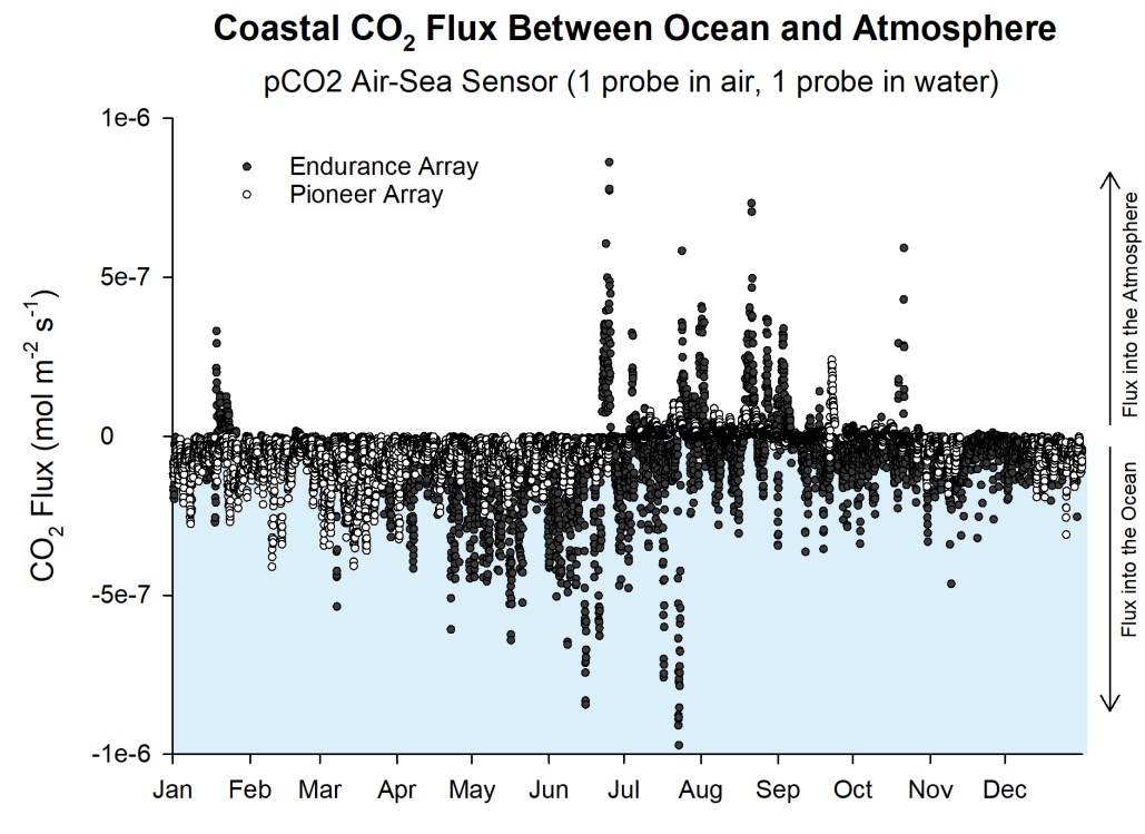
Audio Description for the graph of Coastal carbon dioxide flux between ocean and atmosphere.
Flux of CO2 Between Ocean and Atmosphere
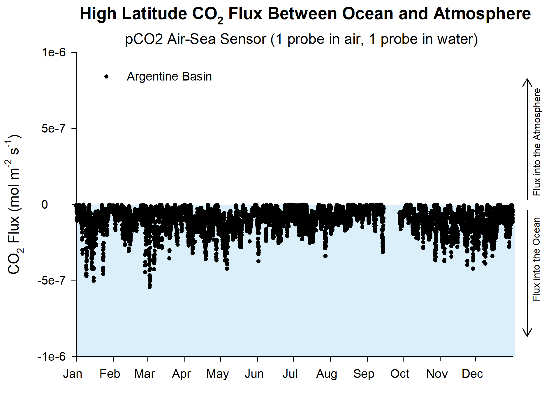
Audio Description for the graph of high-latitude carbon dioxide flux between ocean and atmosphere.
Turbulent Mixing from Extratropical Storm Hermine
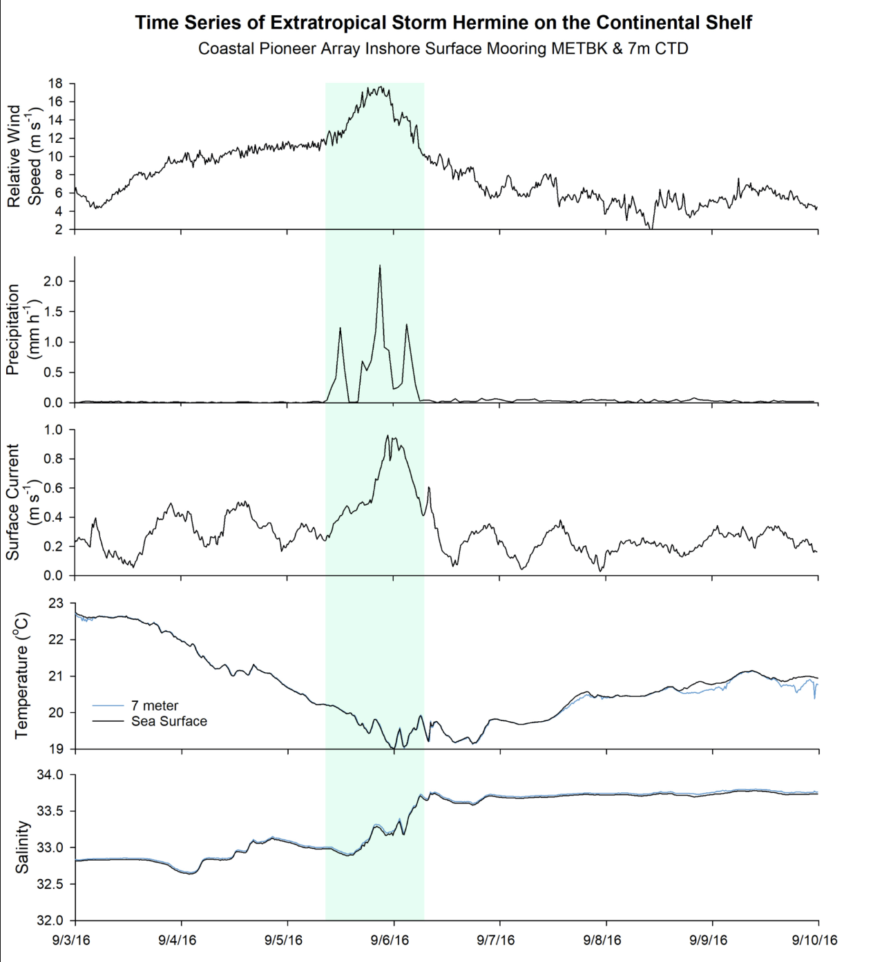
Audio Description for the time-series plot of five meteorological measurements during the storm passage of Extratropical Storm Hermine over the Pioneer mooring array off the coast of New England.
Warm-Core Ring Driven Shelf/Slope Exchange
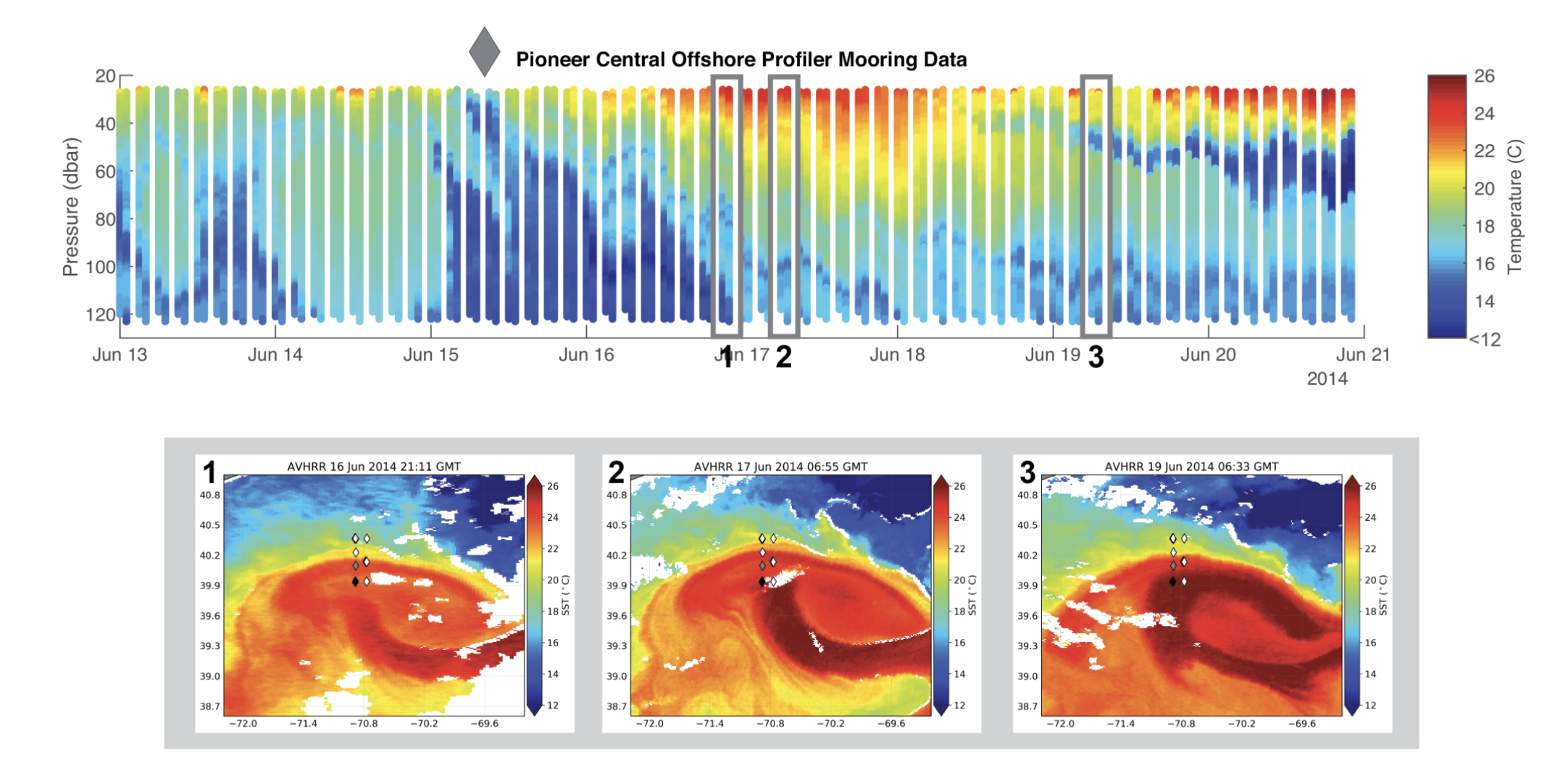
Audio Description for the profiler mooring temperature data graph across its water column over one week in June 2014 and the three 2D images of sea surface temperatures.
References
Smith, L.M., L. Garzio. "2015 Axial Seamount Eruption". Data Nuggets. Ocean Data Labs. 2020. https://datalab.marine.rutgers.edu/data-nuggets/axial-eruption/
Chadwick, B., and S. Nooner. "Blog to chronicle eruption forecasts at Axial Seamount." PMEL Earth-Ocean Interactions Lab. NOAA. https://www.pmel.noaa.gov/eoi/axial_blog.html
Smith, L.M., L. Garzio. "Daily Vertical Migration Gets Eclipsed". Data Nuggets. Ocean Data Labs. 2020. https://datalab.marine.rutgers.edu/data-nuggets/zooplankton-eclipse/
Smith, L.M., L. Garzio. "Flux of CO2 Between Ocean and Atmosphere". Data Nuggets. Ocean Data Labs. 2020. https://datalab.marine.rutgers.edu/data-nuggets/co2-flux/
Smith, L.M., L. Garzio. "Turbulent Mixing from Extratropical Storm Hermine". Data Nuggets. Ocean Data Labs. 2020. https://datalab.marine.rutgers.edu/data-nuggets/extratropical-storm-hermine/
Smith, L.M., L. Garzio. "Warm-Core Ring Driven Shelf/Slope Exchange". Data Nuggets. Ocean Data Labs. 2020. https://datalab.marine.rutgers.edu/data-nuggets/warm-core-ring/
Miellyn Fitzwater Barrows. “Audio Descriptions.” Twenty Thousand Hertz Podcast. DeFacto Sound. February 2017. https://www.20k.org/episodes/audio?rq=audio%20
Learn More
Learn more about audio descriptions (takes you to another site)
Learn more about The Audio Description Project.
Learn more about an audio description narrator and writer.
by Jon Bellona