Auditory Displays
Auditory Displays
As part of the “Accessible Oceans” AISL Pilots and Feasibility study, we have inclusively designed several auditory displays for the perception and understanding of ocean data in informal learning environments (ILEs). The auditory displays are comprised of data sonifications and contextual audio supports (dialogue, auditory icons, and music). The data comes from the National Science Foundation (NSF) Ocean Observatories Initiative (OOI) and the display is based on the OOI Nuggets developed by Dr. Leslie Smith. The displays were built using a human-centered design approach comprised of multiple steps of building and evaluating auditory displays and their components with input from various stakeholder groups, including the blind and low-vision (BLV) community. Read below for descriptions and links to listen to the project's latest auditory displays, including different versions.
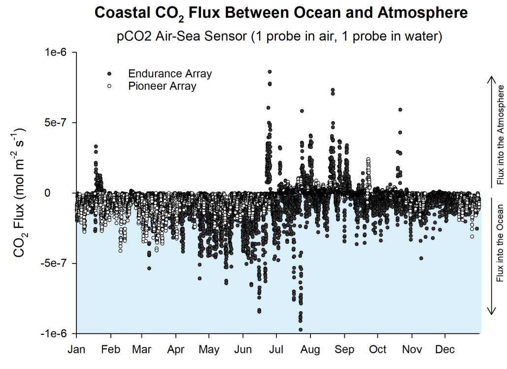
Net flux of CO2 between Ocean and Atmosphere
Version 3 (Synthetic Absorption Sound)
The seven tracks make up an auditory display of the net flux of carbon dioxide between the ocean and the atmosphere. The display is based on an NSF-funded OOI Nugget. The sound design of absorption in data sonifications (tracks 2, 3, and 4) has been updated from a "slurping" parameter-controlled sound (version 2.0) to a synthetic filter parameter-controlled sound (version 3.0), based on user feedback.
Listen online to the 6-minute 21-second auditory display (uses Samply).
Access or cite the auditory display tracks (via Zenodo).
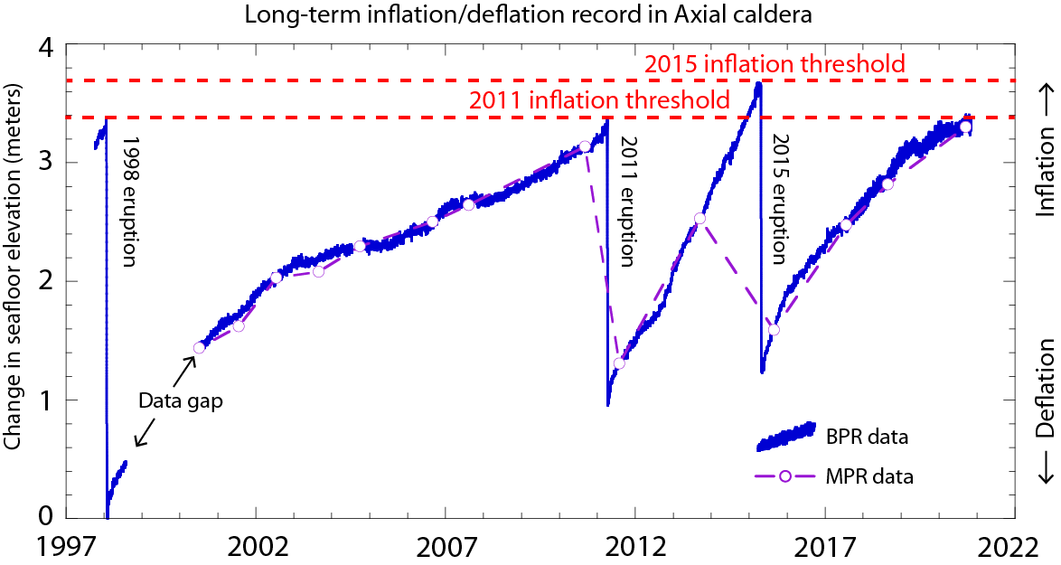
Longterm Axial Seamount Inflation Record
Version 2, Full-length Auditory Display
The thirteen tracks make up an auditory display of the Longterm Axial Seamount Inflation Record. The display leverages data from NOAA PMEL that extend the record of the National Science Foundation (NSF) Ocean Observatories Initiative (OOI) data back to 1997. This audio display focuses on the long-term pattern observed by bottom pressure recorders where the seafloor inflates (lifts), then an eruption event occurs, and the seafloor drops.
Listen online to the 7-minute 5-second auditory display (via Samply).
Access or cite the auditory display tracks (via Zenodo).

Longterm Axial Seamount Inflation Record
Short version
The thirteen tracks make up an auditory display of the Longterm Axial Seamount Inflation Record. The display leverages data from NOAA PMEL that extend the record of the National Science Foundation (NSF) Ocean Observatories Initiative (OOI) data back to 1997. This audio display focuses on the long-term pattern observed by bottom pressure recorders where the seafloor inflates (lifts), then an eruption event occurs, and the seafloor drops.
Listen online to the 2-minute 27-second auditory display (via Samply).
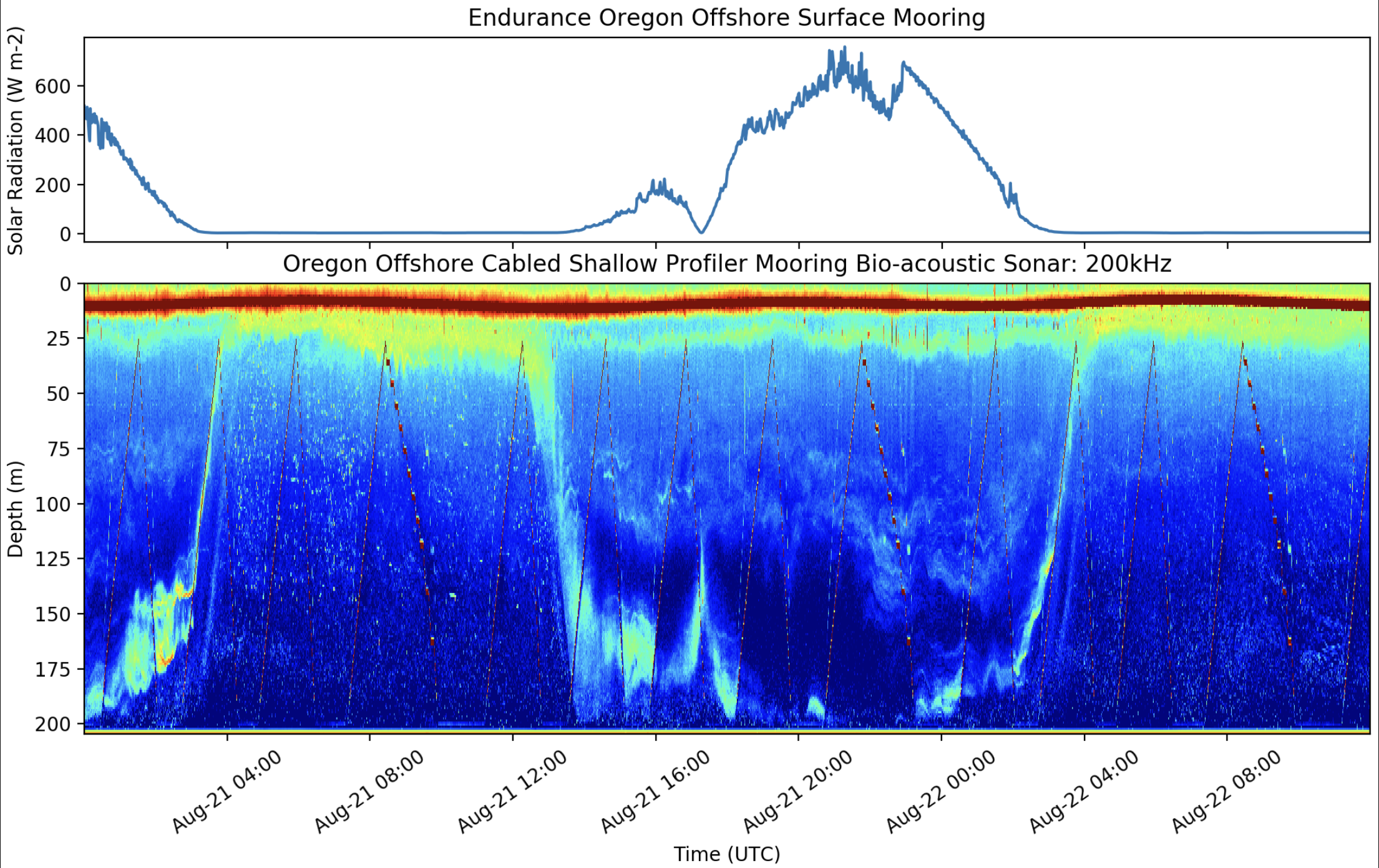
Zooplankton Daily Vertical Migration Gets Eclipsed!
Version 2
The nine tracks make up an auditory display of the daily vertical migration of zooplankton off the coast of Oregon. The display is based on the NSF-funded OOI Nugget. Please note that there is no track 1B in this version. We removed track 1B in order to reduce redundancy in the display.
Listen online to the 8-minute 2-second auditory display (via Samply).
Access or cite the auditory display tracks (via Zenodo).
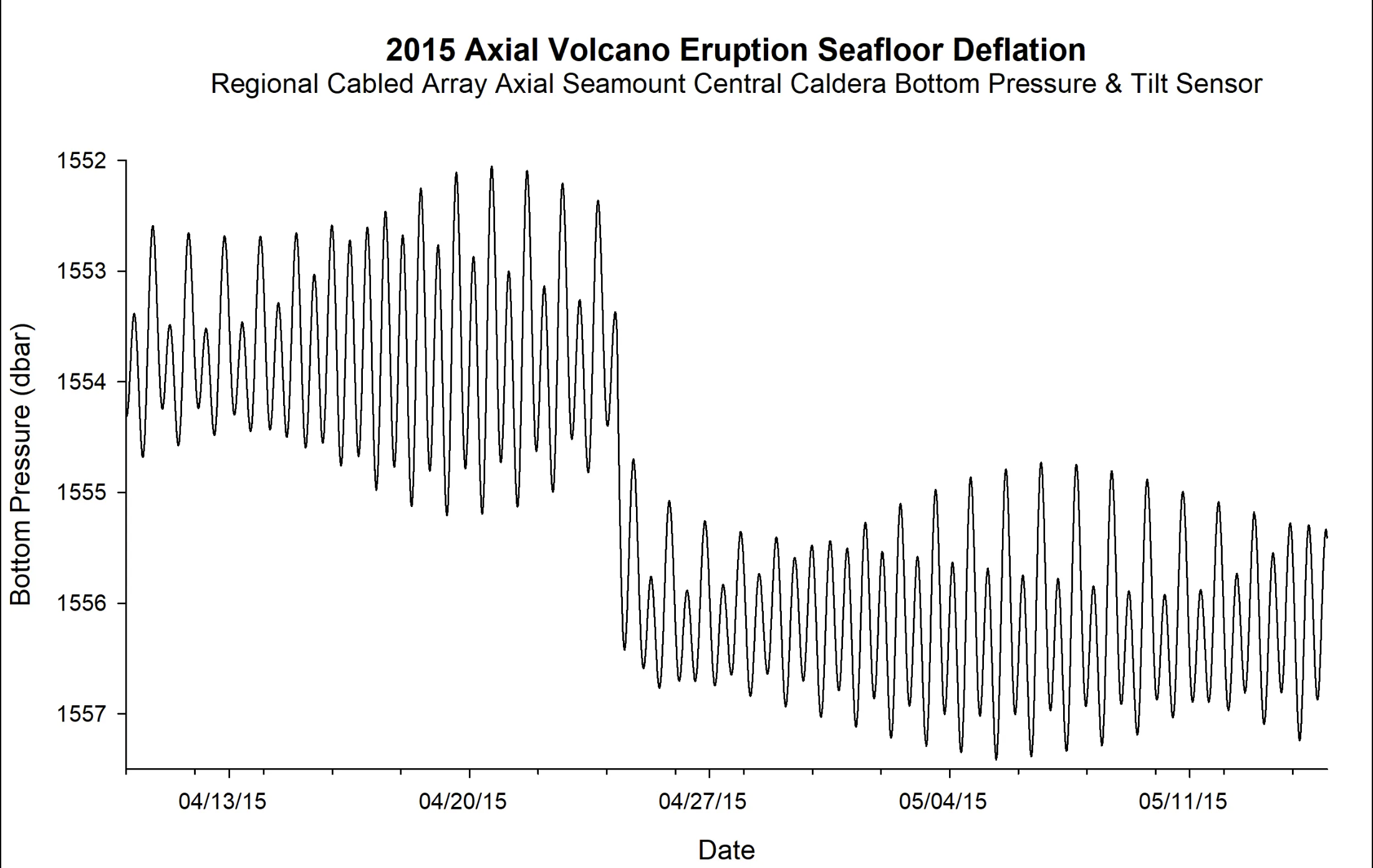
2015 Axial Seamount Eruption
Version 2
The ten tracks make up an auditory display of the 2015 Axial Seamount Eruption. The display is based on the NSF-funded OOI Nugget. Over the course of a 24-hour period, several Cabled Array instruments detected ~8,000 earthquakes and a seafloor drop of 2.4 m. The data within this nugget are from a bottom pressure and tilt sensor deployed on the Axial Seamount.
Listen online to the 7-minute 1-second auditory display (via Samply).
Access or cite the auditory display tracks (via Zenodo).
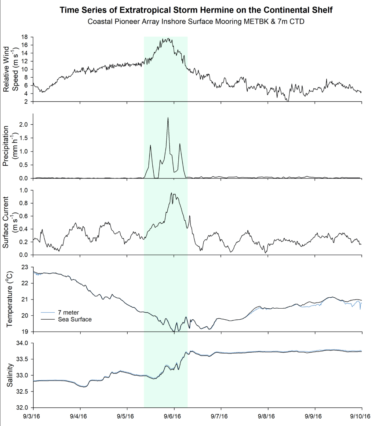
Ocean Response to Extratropical Storm Hermine
Version 3
The twenty-one tracks make up an auditory display of the ocean response to extratropical storm Hermine in 2016. The display is based on the NSF-funded OOI Nugget. Please note that the Ocean Labs data nugget does not include sea wave height as part of its graph that we sonified. Storms also impact sea wave height, and Dr. Leslie Smith acquired this data from the OOI so that we could include it in the sonification and auditory display. Version 3 updates the wave height sonification design. The design in version 2 had frequency decreasing as waves grew larger to model the physical world; however, we switched the timbre and frequency mapping based on conference and user testing feedback.
Listen online to the 9-minute 28-second auditory display (via Samply).
Access or cite the auditory display tracks (via Zenodo).