Authentic Ocean Data
Authentic Ocean Data
Integrating authentic data into learning environments provides unique opportunities for active learning and problem solving using real world applications. There are several challenges, however, in integrating these data into learning environments, particularly information learning environments where the background knowledge of you audience can vary widely. First, the inherent size and complexity of many authentic datasets as well as the limited quality control and processing conducted on near-real time streaming data can make them unwieldy for educators to work with. Second, in the instances when these authentic datasets are curated for an educational setting, they rely entirely on visual displaces, making them inaccessible to anyone with a visual impairment, other print-related disability, or innumeracy. By scaffolding authentic data to support sensemaking in learners from a wide range of backgrounds and abilities, we aim to broaden participation in STEM and showcase to all audiences sonification as a way to perceive scientific information.
The Accessible Oceans project uses authentic data from the National Science Foundation-funded Ocean Observatories Initiative (OCE-1743430) that was quality controlled during the OOI 1.0 Data Review and processed into Data Nuggets during the OOI Synthesis & Education project (NSF OCE-1841799). For more information and perspectives on integrating OOI data sets into the classroom, check out Greengrove, et al., 2020. "Using Authentic Data from NSF's ocean Observatories Initiative in Undergraduate Teaching: An Invitiation." https://doi.org/10.5670/oceanog.2020.103.
Click on the links below to learn more about each of the curated datasets used in the Accessible Oceans Project.
OOI Data Nuggets
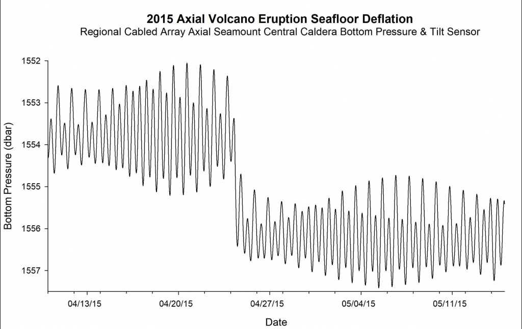 2015 Axial Seamount Eruption
Explore seafloor deflation on the Axial Seamount during the 2015 eruption with data from the OOI Regional Cabled Array.
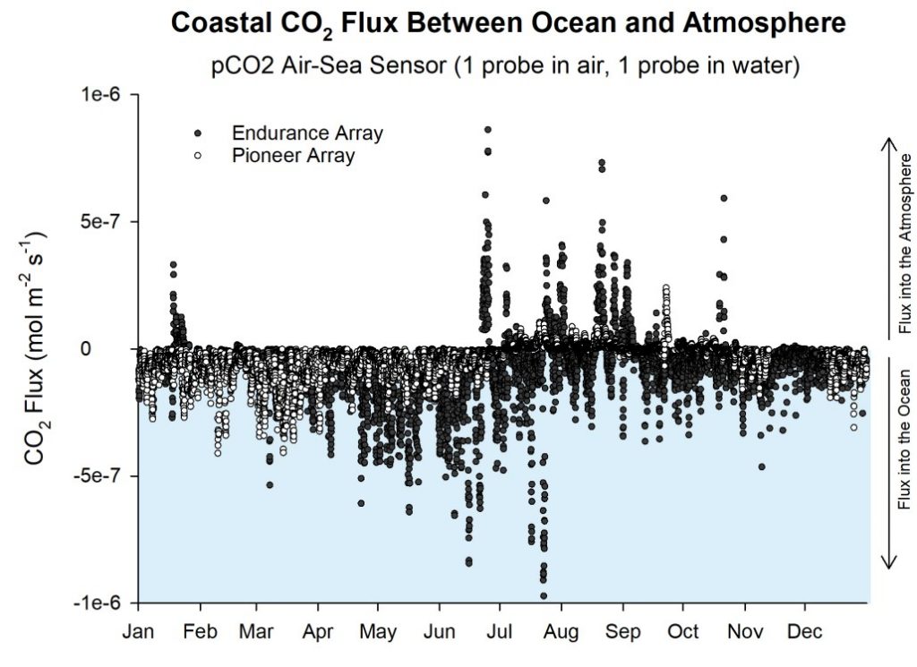 FLUX OF CO2 BETWEEN
OCEAN AND ATMOSPHERE
Explore air-sea exchange of CO2 in two different ocean regions – coastal upwelling in the NE Pacific (OOI Endurance Array) and the cold, high latitude Argentine Basin (OOI Global Array).
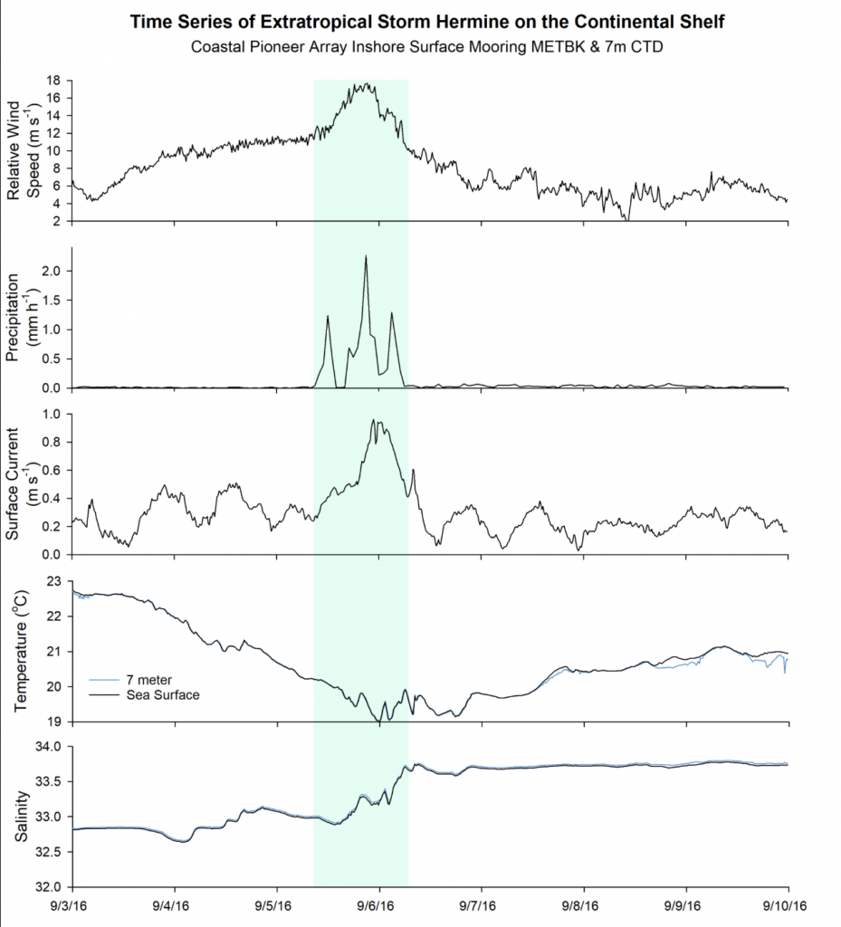 Turbulent Mixing from Extratropical Storm Hermine
Explore what happens to coastal New England waters as an extratropical storm passes over the OOI Pioneer Array.
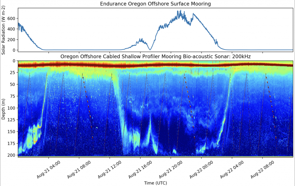 Daily Vertical Migration Gets Eclipsed!
Explore what happens to zooplankton during a total solar eclipse using Bio-acoustic Sonar data from the Endurance Array Oregon Offshore Shallow Profiler Mooring.
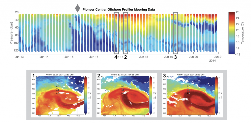 Warm-Core Ring Driven Shelf/Slope Exchange
Explore changes in the local environment around two OOI Pioneer Array Moorings as a warm-core ring passes by.
For more information on Data Nuggets, check out the Ocean Data Labs website.