What is Data Mapping?
Data mapping refers to the design choices of applying values from a data set onto any number of controls of sound. Controls may include modifications of digital sound synthesis, audio samples, audio effects, and spatialization, among many others.
Data mapping and choices around mapping play a critical role in sonification. In sonification, choices in data mapping help satisfy those qualitative definitions of sonification—‘reproducible’, ‘perceived relations’, ‘facilitating communication’, and ‘conveying information’. Creating sonification means creating a perceptible aural depiction of the data, an “inference preserving mapping” (Scaletti 2018). Mismatches between data and perception can start to rise when data mapping in sonification focuses on musical outcomes like emotional affect and not the perceived relations of the data.
To paraphrase Kat Holmes’ methods for inclusive design, if creating sonification required coding, data literacy, and musical background, the only sonifications we’d hear would be from people who matched these requirements. If we want our sonifications to communicate more broadly to those without musical backgrounds, by which I generally mean music backgrounds predominantly steeped in Western tonal theory, the sonic maps we create need more than just musical mappings.
Data mapping can be fun, but the process is prone to individual biases and preferences. For example, if I map the data to a pentatonic music scale so the data never play any wrong notes, the data may be grossly distorted and the pleasing sound of the mapping creates an affect or feeling that may have little to do with the information or narrative highlighted in the data. The process can also produce almost infinite sonic outcomes.
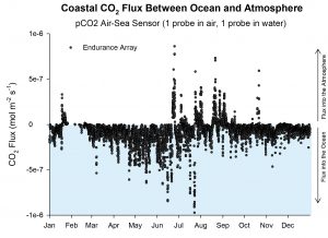
As an example of data mapping’s broad sonic palette, let’s listen to two different mapping examples using the same data set: the flux of CO2 between ocean and atmosphere as measured by the Coastal Endurance Array off the coast of New England (Smith and Garzio 2020). The first sonification maps the single stream of numeric values to notes on the piano. Lower values are lower notes on the piano and higher values are higher notes on the piano (listen to Sonification A below). The second sonification maps the values onto two types of sound. Positive values—the net flux of C02 from ocean into the atmosphere—control the amplitude of white noise. These positive values are also mapped to playback in the right channel, or right ear. Negative values—the net flux of CO2 from the atmosphere into the ocean—are mapped to a low-frequency oscillator. These negative values are also mapped to playback in the left channel, or left ear (listen to Sonification B below).
What do you hear in these sonifications? What is different in how you listen to these two examples? How does the data mapping impact your perception? Which of these two sonifications do you think best communicates the phenomenon?
Media
Sonification A: Musical mapping of data values to pitches on the piano and utilizing stereo piano image.
Sonification B: Non-musical mapping of data values to left/right channels, noise amplitude, and oscillator frequency.
References
Holmes, Kat. Mismatch: How Inclusion Shapes Design. Simplicity : Design, Technology, Business, Life. Cambridge, Massachusetts ; London, England: The MIT Press, 2018: 54.
Scaletti, Carla. “Sonification ≠ Music.” In Oxford Handbook of Algorithmic Composition, edited by Roger T. Dean and Alex McLean, 1:363--385. Oxford University Press, 2018. https://doi.org/10.1093/oxfordhb/9780190226992.013.9.
Learn More
Learn more about CO2 net flux between ocean and atmosphere by visiting the NSF-funded Ocean Data Labs, Data Nuggets https://datalab.marine.rutgers.edu/data-nuggets/co2-flux/
by Jon Bellona